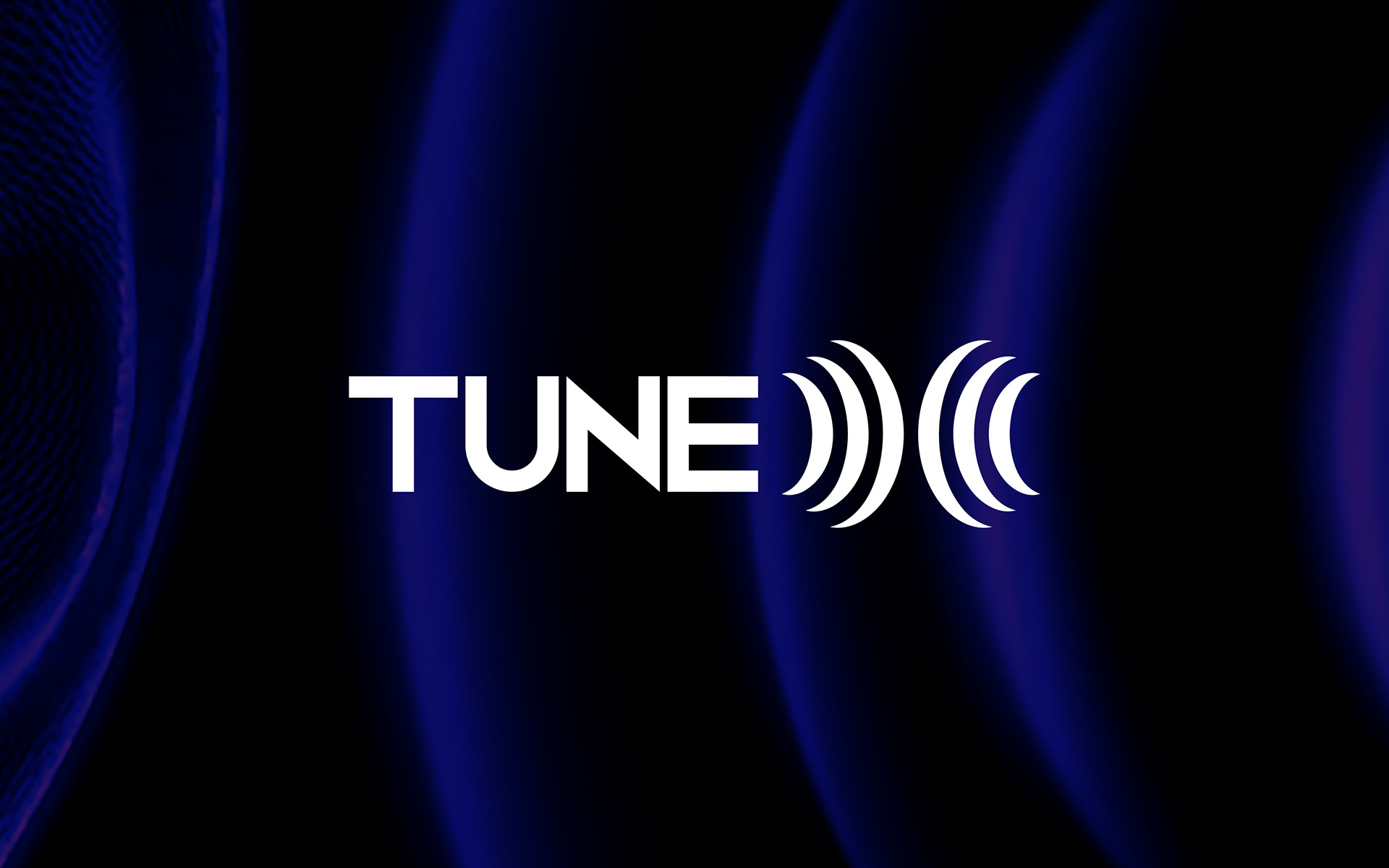
Logo Design | TuneX
Client: TuneX
Industry: Sound Design & Audio Branding
🔊 Concept Overview:
The logo for TuneX was crafted with a deep understanding of how sound can shape perception, mood, and brand identity. TuneX isn’t just another sound company—it’s a creative force that sculpts immersive audio experiences. That philosophy inspired a design built not just around aesthetics, but meaning.
🎨 Design Elements:
Sound Waves as Structure:
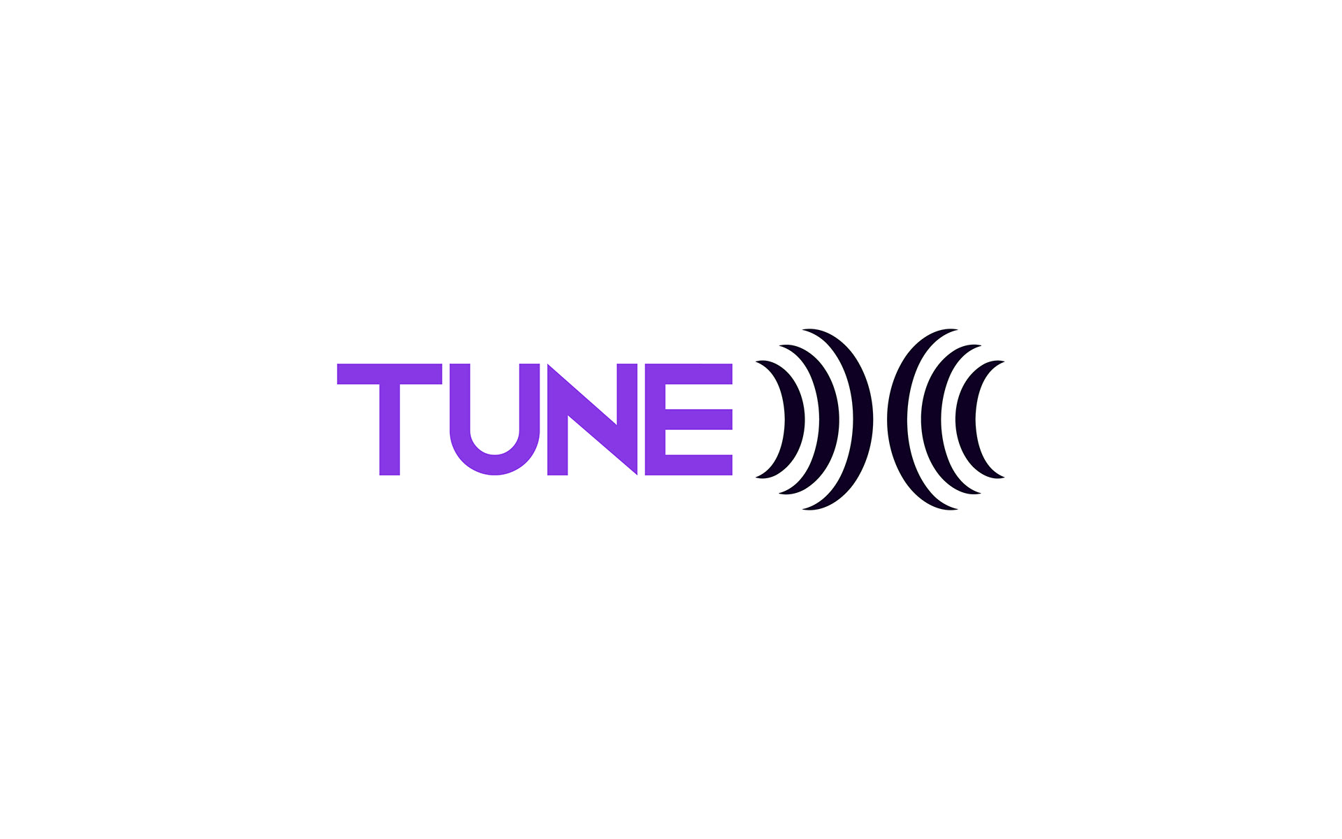
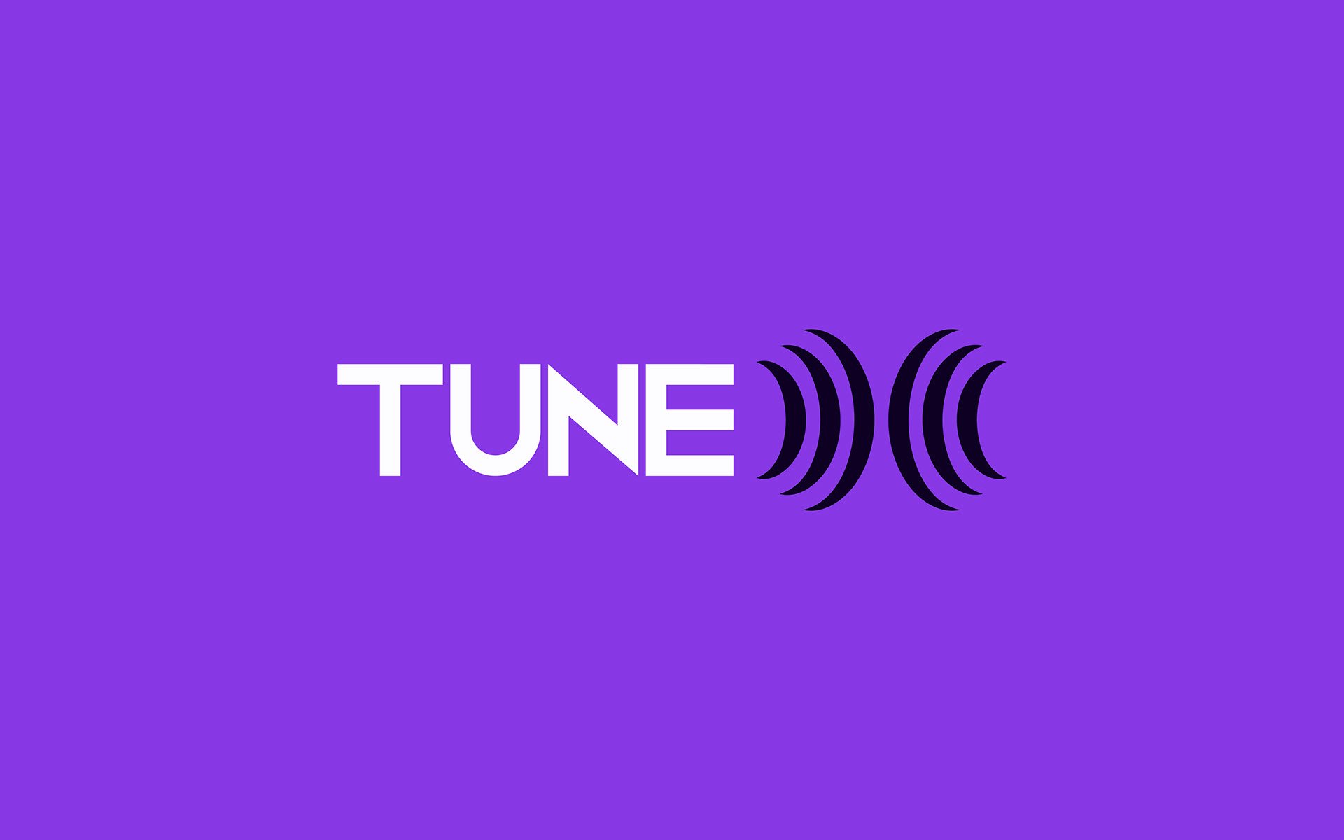
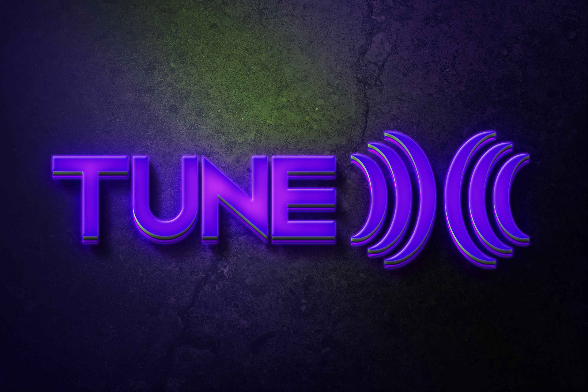
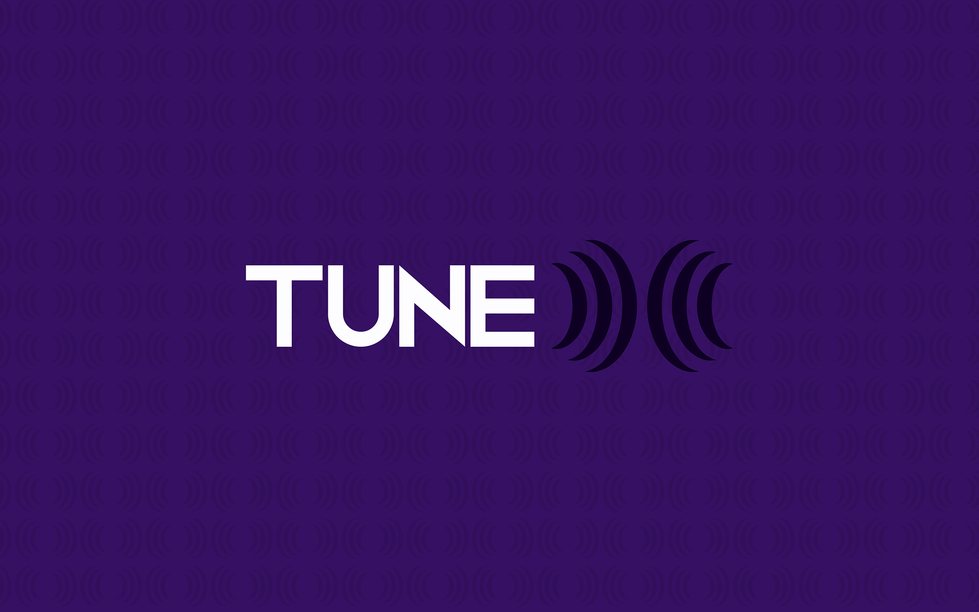
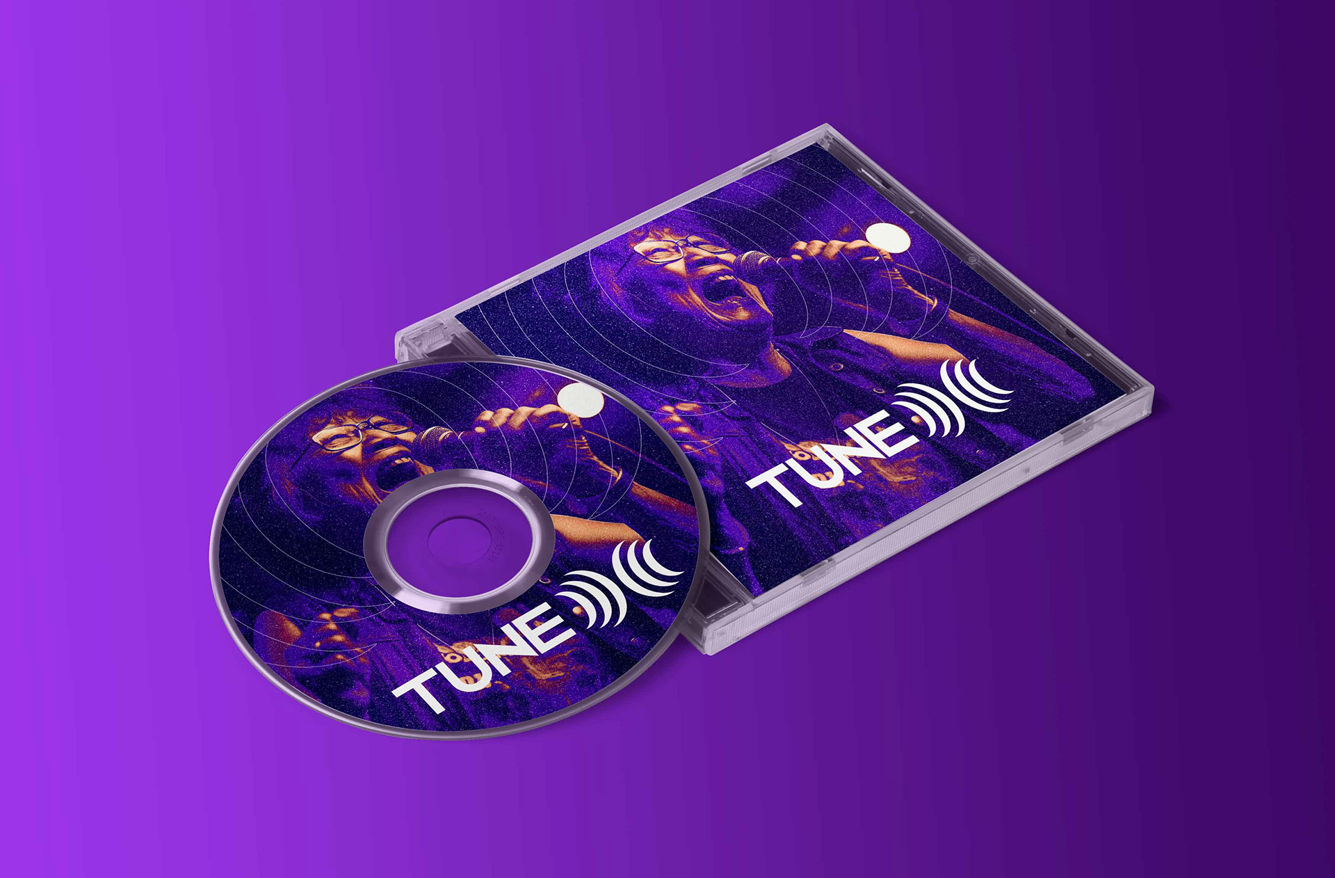
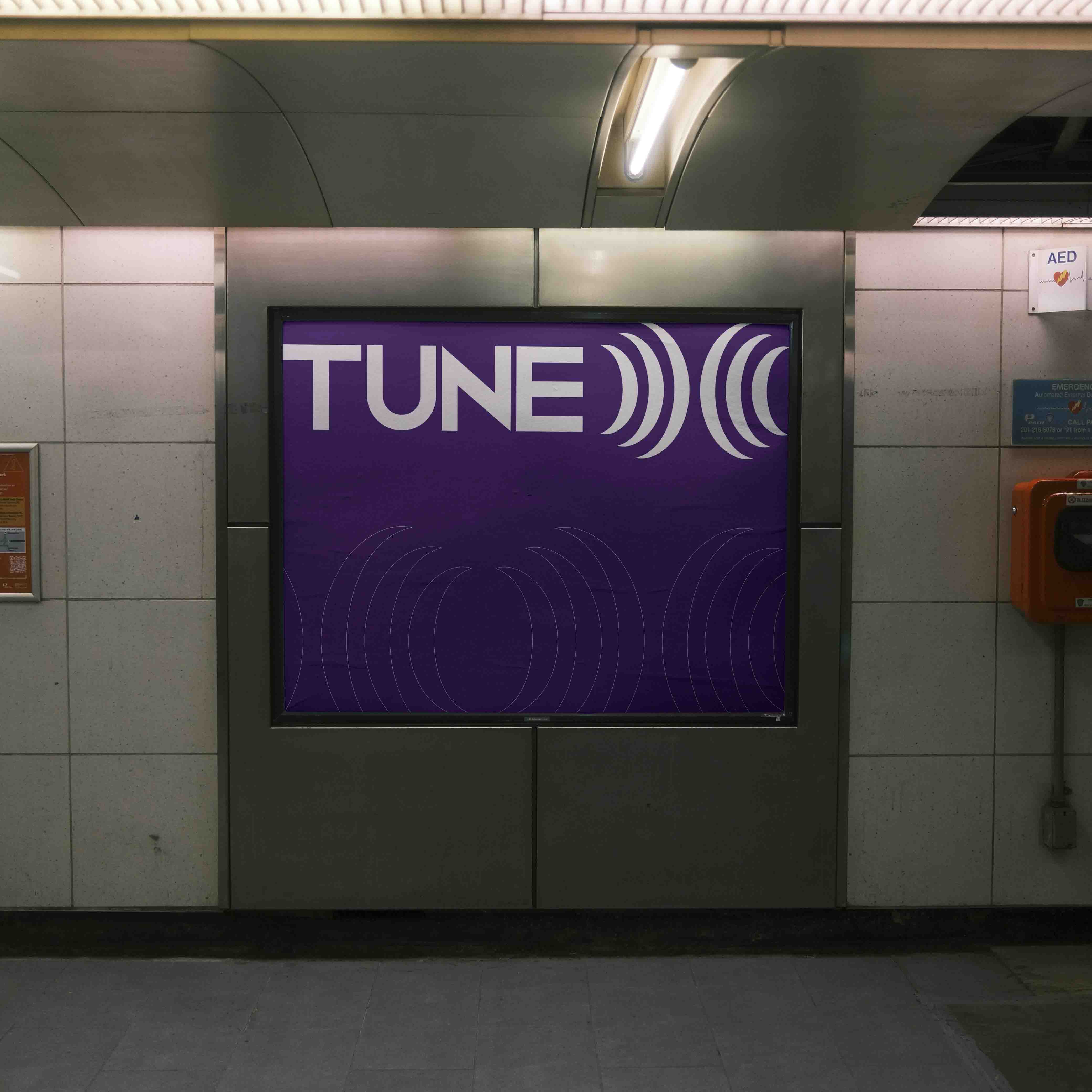
The most distinct visual feature is how dynamic sound waves emerge from both the left and right, converging at the center. These symmetrical waveforms symbolize sound traveling in space, resonating with the core idea of stereo sound or surround experiences — essential in high-end audio design.
Letter "X" Formation:
As the waves curve and intersect, they organically form the letter “X” — the central identity of the brand. This X doesn't just stand for the name "TuneX", but also reflects cross-collaboration, precision mixing, and the meeting point of creativity and technology.
Clean and Modern Typeface:
Accompanying the symbol is a minimal, futuristic typeface that represents the cutting-edge and tech-forward nature of TuneX’s services. The type treatment is subtle to ensure the soundwave-X takes visual dominance while maintaining overall balance.
🎯 Symbolism & Message:
Symmetry & Harmony – representing perfectly balanced audio.
Motion & Energy – the waveforms suggest liveliness and constant movement, just like sound.
Centralized Creativity – the “X” at the center acts as a visual anchor and symbolic powerhouse.
Stereo Identity – wave direction from both sides mimics real stereo or surround systems, emphasizing spatial sound.
🧠 Creative Thought Behind the Logo:
As a designer, I wanted the auditory concept to be visually felt. Rather than just drawing an "X", I wanted to let sound shape the letter itself — to show that at TuneX, everything originates from audio.
This logo not only stands out visually, but it sounds like a brand even without audio.
🛠️ Logo Application Potential:
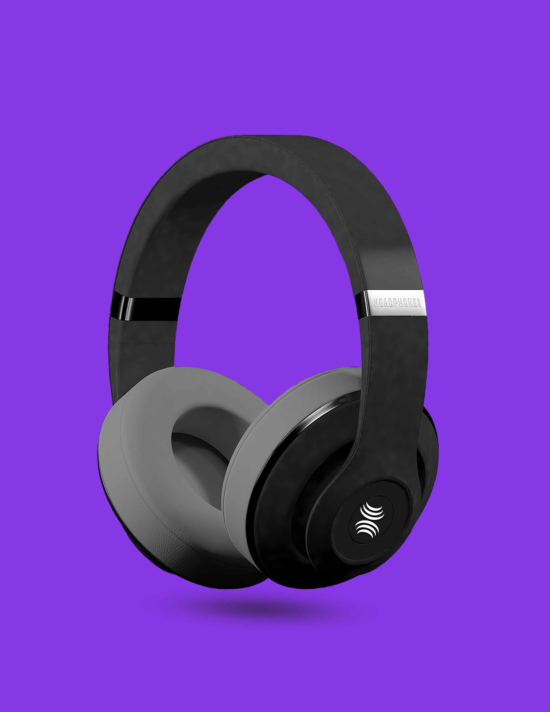
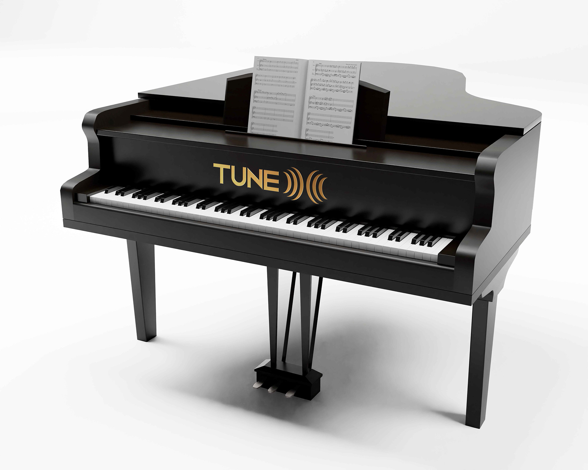
Works beautifully on music platforms, studio doors, sound boards, website headers, and app icons.
The X-symbol can act as a standalone monogram for future merchandise, branding assets, or digital watermarks.
Responsive logo format — can be broken into icon, symbol, and wordmark for various media uses.
🚀 Ready to Hear the Future?
TuneX’s logo reflects audio craftsmanship, precision, and immersive sound experiences. Every element was designed with clarity, rhythm, and purpose.
If you're looking to bring your brand identity to life — with meaning and magic — I’d love to collaborate with you.
Industry: Sound Design & Audio Branding
🔊 Concept Overview:
The logo for TuneX was crafted with a deep understanding of how sound can shape perception, mood, and brand identity. TuneX isn’t just another sound company—it’s a creative force that sculpts immersive audio experiences. That philosophy inspired a design built not just around aesthetics, but meaning.
🎨 Design Elements:
Sound Waves as Structure:
The most distinct visual feature is how dynamic sound waves emerge from both the left and right, converging at the center. These symmetrical waveforms symbolize sound traveling in space, resonating with the core idea of stereo sound or surround experiences — essential in high-end audio design.
Letter "X" Formation:
As the waves curve and intersect, they organically form the letter “X” — the central identity of the brand. This X doesn't just stand for the name "TuneX", but also reflects cross-collaboration, precision mixing, and the meeting point of creativity and technology.
Clean and Modern Typeface:
Accompanying the symbol is a minimal, futuristic typeface that represents the cutting-edge and tech-forward nature of TuneX’s services. The type treatment is subtle to ensure the soundwave-X takes visual dominance while maintaining overall balance.
🎯 Symbolism & Message:
Symmetry & Harmony – representing perfectly balanced audio.
Motion & Energy – the waveforms suggest liveliness and constant movement, just like sound.
Centralized Creativity – the “X” at the center acts as a visual anchor and symbolic powerhouse.
Stereo Identity – wave direction from both sides mimics real stereo or surround systems, emphasizing spatial sound.
🧠 Creative Thought Behind the Logo:
As a designer, I wanted the auditory concept to be visually felt. Rather than just drawing an "X", I wanted to let sound shape the letter itself — to show that at TuneX, everything originates from audio.
This logo not only stands out visually, but it sounds like a brand even without audio.
🛠️ Logo Application Potential:
Works beautifully on music platforms, studio doors, sound boards, website headers, and app icons.
The X-symbol can act as a standalone monogram for future merchandise, branding assets, or digital watermarks.
Responsive logo format — can be broken into icon, symbol, and wordmark for various media uses.
🚀 Ready to Hear the Future?
TuneX’s logo reflects audio craftsmanship, precision, and immersive sound experiences. Every element was designed with clarity, rhythm, and purpose.
If you're looking to bring your brand identity to life — with meaning and magic — I’d love to collaborate with you.
Gallery

Comments
Leave a Comment