
Logo Design | wanderNest
🧠 Concept Development:
The challenge was to create a single symbol that reflects both movement and home — two concepts that are usually visually opposite.
Visual Strategy:
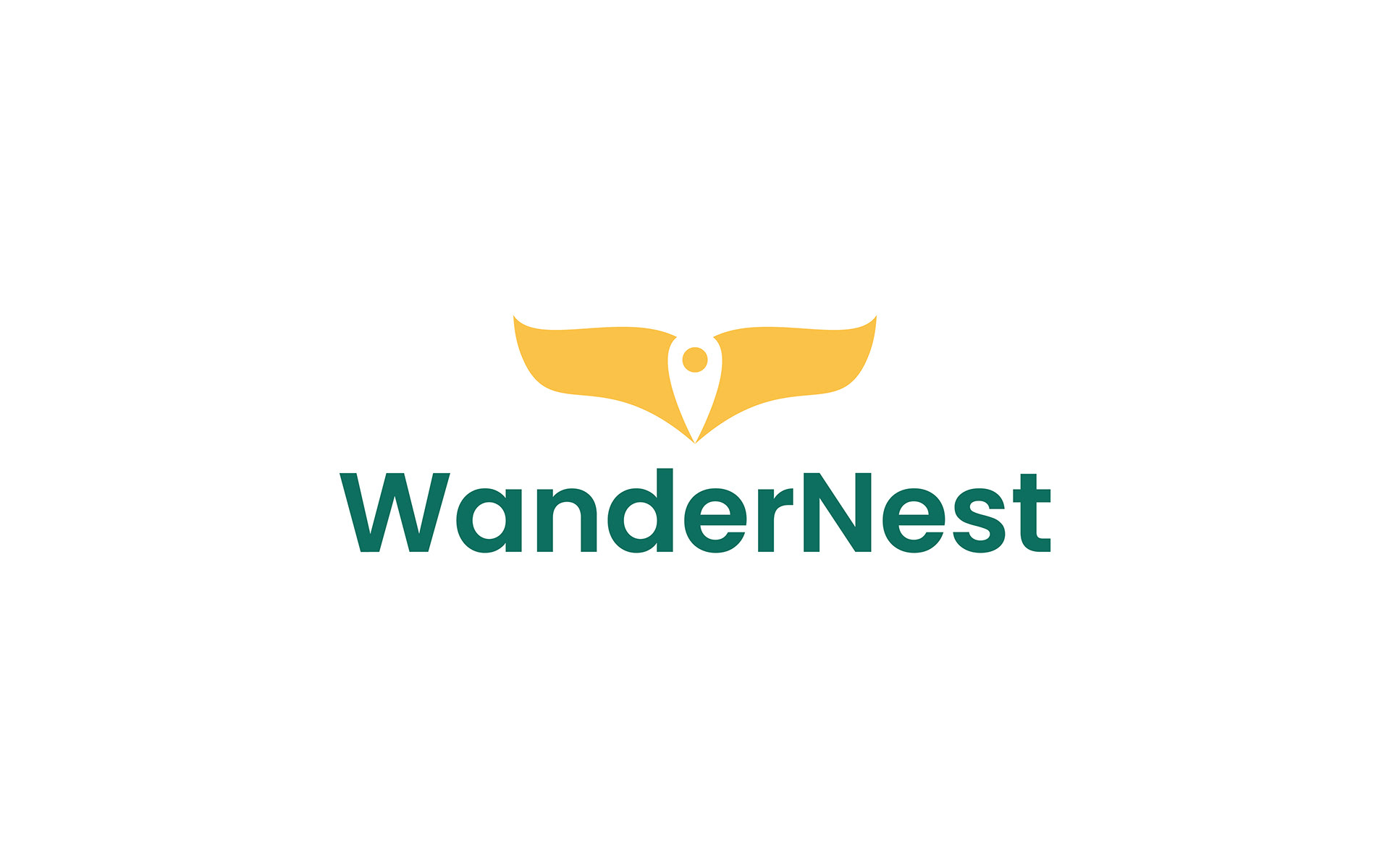
Wings: To symbolize travel, freedom, exploration, and the spirit of wandering
Map Pin in Negative Space: To symbolize direction, arrival, and a destination that feels like home
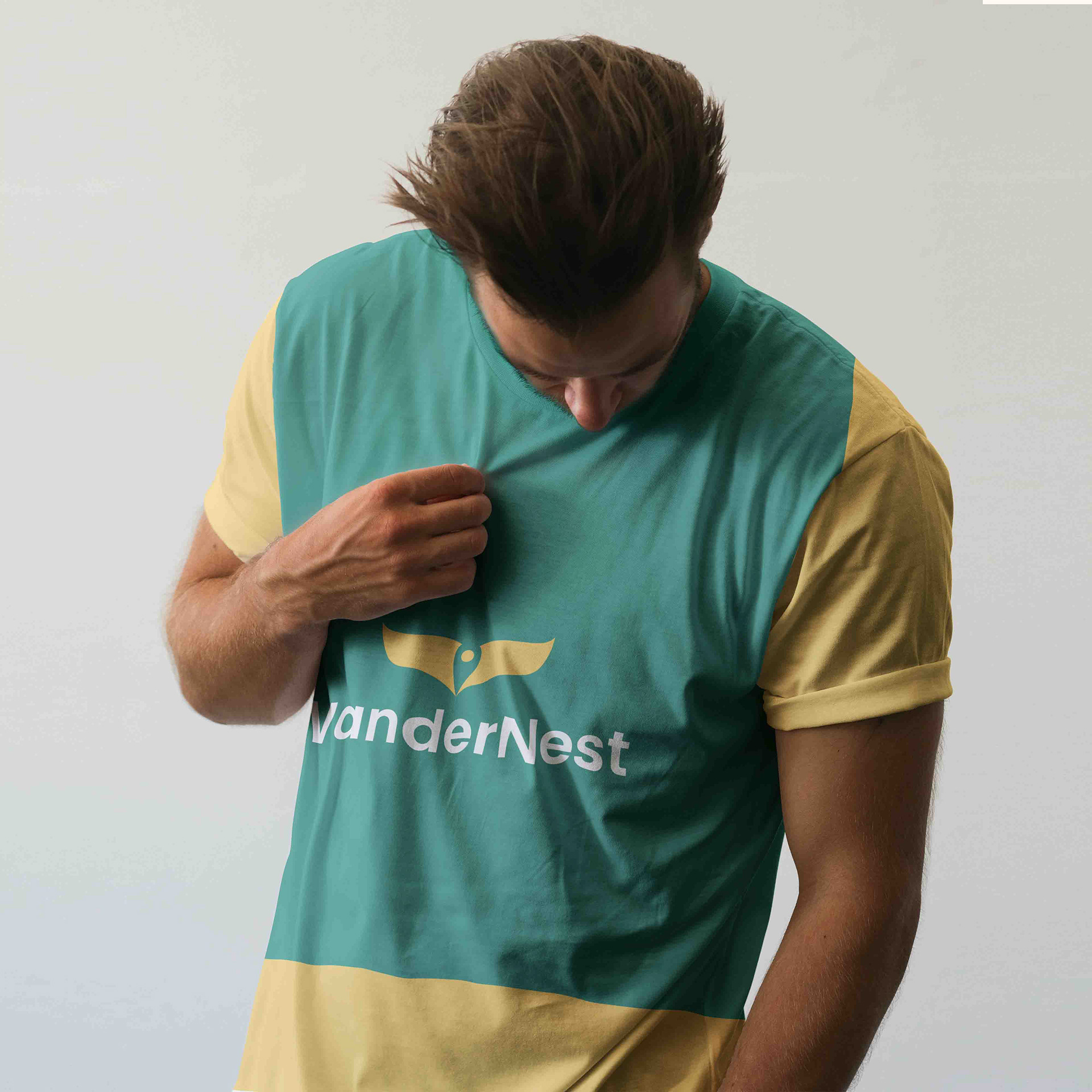
The wings stretch outward to express openness and movement, while the negative space between them forms a map pin, anchoring the design with a clear destination point. This duality is where the heart of the concept lives — you’re free to roam, but you always have a place to land.
The challenge was to create a single symbol that reflects both movement and home — two concepts that are usually visually opposite.
Visual Strategy:
Wings: To symbolize travel, freedom, exploration, and the spirit of wandering
Map Pin in Negative Space: To symbolize direction, arrival, and a destination that feels like home
The wings stretch outward to express openness and movement, while the negative space between them forms a map pin, anchoring the design with a clear destination point. This duality is where the heart of the concept lives — you’re free to roam, but you always have a place to land.
Gallery



Comments
Leave a Comment