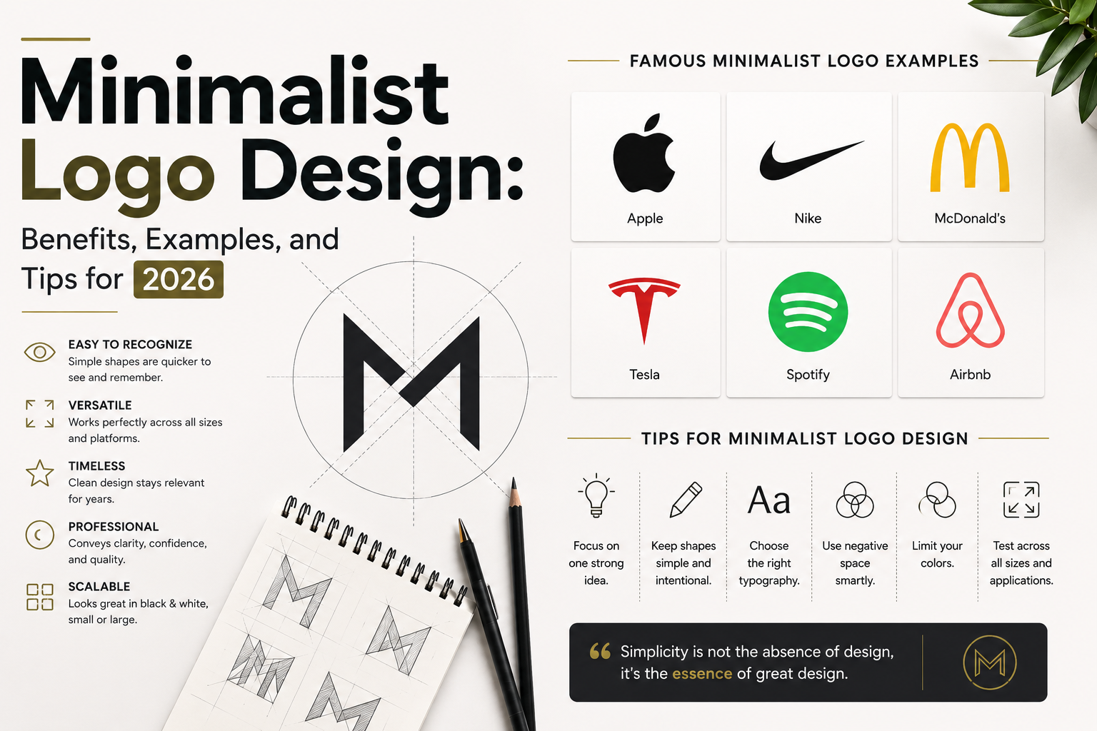
Minimalist logo design has become one of the most influential approaches in modern branding.
But minimalist design doesn't simply mean making a logo smaller, using fewer colors, or removing details.
True minimalism is about communicating more with less.
A strong minimalist logo can be simple, recognizable, flexible, and memorable without relying on unnecessary visual elements.
This is particularly important in 2026, when brands need their logos to work across websites, social media profiles, mobile applications, advertisements, packaging, merchandise, and AI-generated content.
But what makes a minimalist logo successful?
And why do so many modern brands prefer simpler visual identities?
Let's explore it.
What Is Minimalist Logo Design?
Minimalist logo design is an approach that focuses on simplicity, clarity, functionality, and essential visual elements.
Instead of filling a logo with multiple colors, detailed illustrations, effects, and decorative elements, minimalist design focuses on the elements that are actually necessary to communicate the brand.
A minimalist logo may use:
- Simple geometric shapes
- Clean typography
- Limited colors
- Negative space
- Basic symbols
- Simple letterforms
- Monograms
- Abstract shapes
- Strong visual proportions
The goal isn't to make the logo look empty.
The goal is to make the design clear and intentional.
Why Is Minimalist Logo Design So Popular?
Modern brands exist across more platforms than ever.
A logo may need to appear on a tiny social media profile, a smartphone screen, a website header, packaging, advertisements, signage, and large-scale displays.
A complicated logo can struggle when it becomes very small.
A simple logo can often maintain its identity across different applications.
This makes minimalism particularly useful for modern brand systems.
1. Minimalist Logos Are Easier to Recognize
People often encounter logos very quickly.
Someone might see your logo for only a few seconds while:
- Scrolling social media
- Visiting a website
- Walking past a store
- Watching an advertisement
- Looking at product packaging
A simple visual structure can make recognition easier.
When there are fewer unnecessary elements competing for attention, the main visual idea becomes clearer.
2. Simple Logos Can Be More Memorable
A memorable logo doesn't need to contain a lot of information.
In many cases, a strong visual concept is easier to remember than a complicated illustration.
Think about a simple symbol or distinctive wordmark.
Once people associate that visual with a company, the logo can become a mental shortcut for the entire brand.
The objective isn't:
“How much can I put into this logo?”
It's:
“What is the strongest idea I can communicate?”
3. Minimalist Logos Are Highly Versatile
A professional logo needs to work in many situations.
For example:
Website
Instagram profile
Business card
Packaging
App icon
Signage
Advertisement
Merchandise
Presentation
Video content
A minimalist logo generally has an advantage because its essential shapes and typography can remain recognizable across different sizes and formats.
4. Minimalism Can Make a Brand Look More Professional
Minimalist design is often associated with:
- Clarity
- Sophistication
- Modernity
- Confidence
- Simplicity
- Premium positioning
However, minimalism doesn't automatically make a brand professional.
A poorly designed simple logo can look generic.
The quality comes from the concept, typography, proportions, spacing, and execution.
5. Minimalist Logos Work Well in Digital Environments
Digital branding has changed how logos are used.
A logo might appear as a tiny profile picture or favicon one moment and as a large website graphic the next.
Minimalist logos are often well suited to these environments because they can remain visually clear at smaller sizes.
This is particularly useful for:
- Mobile apps
- Websites
- Social media
- SaaS products
- Technology companies
- Digital businesses
- Online stores
6. Minimalist Design Can Improve Brand Consistency
A logo is only one part of a brand identity.
It needs to work with:
- Typography
- Colors
- Photography
- Icons
- Illustrations
- Layouts
- Packaging
- Social media graphics
A simple logo can provide a strong foundation for a broader visual system.
This allows designers to build consistent brand assets without every application becoming visually complicated.
7. Minimalist Logos Can Have Longer Lifespans
Design trends change.
What looks modern today may look outdated several years later.
Minimalist logos can sometimes remain relevant for longer because they rely less on temporary visual trends.
But this doesn't mean every minimalist logo is timeless.
A logo can still become dated if it relies too heavily on a specific trend.
The goal should be simple and distinctive, not simply trendy.
Minimalist Logo Design Examples
Some of the world's most recognizable brands demonstrate how powerful simple visual identities can be.
Examples include:
Apple
The Apple symbol is a simple silhouette with a distinctive visual idea.
It doesn't attempt to show everything the company does.
Its simplicity allows it to function across countless applications.
Nike
The Swoosh is an excellent example of reducing an idea into a highly recognizable shape.
It doesn't literally represent every product Nike sells.
Instead, it has become strongly associated with the brand through years of consistent use.
Adidas
Adidas has used several recognizable simplified visual marks throughout its branding history, demonstrating how simple geometric forms can become powerful brand identifiers.
McDonald's
The Golden Arches demonstrate how a relatively simple shape can become strongly associated with a global brand.
These examples show an important principle:
A logo doesn't need to visually explain the entire business to become memorable.
Minimalist Logo Design Doesn't Mean Generic Design
This is one of the biggest mistakes designers make.
They hear:
“Keep it minimal.”
And create:
- A generic circle
- A basic sans-serif font
- A random letter
- Two neutral colors
The result may be clean.
But clean doesn't automatically mean memorable.
A successful minimalist logo still needs a distinctive concept.
Ask:
What makes this logo recognizable?
What makes it different from competitors?
What idea does it communicate?
Can the brand own this visual territory?
Minimalism should remove unnecessary elements—not personality.
The Role of Negative Space in Minimalist Logo Design
Negative space is the empty area surrounding or within a design.
Professional designers can use negative space intentionally to create secondary meanings.
For example, an empty area within a symbol might form:
- A letter
- An object
- A hidden shape
- A directional element
- A visual metaphor
This can create a moment of discovery.
However, negative space should serve a purpose.
Adding a hidden shape simply to make a logo “clever” can make the concept unnecessarily complicated.
Typography in Minimalist Logos
Typography becomes particularly important when a minimalist logo contains a wordmark.
When there are fewer visual elements, every detail becomes more noticeable.
Things such as:
- Letter spacing
- Font weight
- Character proportions
- Custom lettering
- Alignment
- Capitalization
- Stroke thickness
can significantly affect the personality of the logo.
A designer might customize one or two letters to create something more distinctive.
This is often more effective than simply choosing a popular font and typing the brand name.
Color in Minimalist Logo Design
Minimalist logos often use a limited color palette.
You might see:
- Black and white
- One primary color
- Two complementary colors
- A neutral palette
But minimalism doesn't require monochrome design.
A colorful logo can still be minimalist if the colors are used intentionally.
The important thing is to avoid using color simply to compensate for a weak concept.
A strong logo should ideally work in one color before the full color version is considered.
How to Create a Minimalist Logo
Here is a practical process designers can follow.
Step 1: Understand the Brand
Before sketching, understand:
- What does the company do?
- Who is the audience?
- What makes it different?
- What personality should it have?
- What should customers feel?
- Where will the logo be used?
Step 2: Research the Competition
Look at competitors.
Don't copy their visual language.
Instead, identify patterns.
If every competitor uses the same icon and color, that may represent an opportunity to create something different.
Step 3: Define the Core Idea
Ask:
What is the one idea this logo needs to communicate?
Don't try to represent every feature of the business.
Choose the strongest concept.
Step 4: Sketch Multiple Directions
Start with rough ideas.
Explore:
- Symbols
- Letterforms
- Monograms
- Geometric shapes
- Negative space
- Abstract concepts
- Wordmarks
Don't worry about perfection at this stage.
Focus on ideas.
Step 5: Remove Unnecessary Elements
Now start simplifying.
Ask:
Can this line disappear?
Does this shape add meaning?
Is this color necessary?
Can this symbol be simplified?
Can the typography be stronger?
This is where minimalism starts becoming intentional.
Step 6: Test the Logo
Don't only look at the logo on your artboard.
Test it as:
- A small social media icon
- A website logo
- A favicon
- A business card
- Packaging
- A large sign
- A black-and-white version
If the logo fails when it becomes small, it needs refinement.
Common Minimalist Logo Design Mistakes
Making It Too Simple
Removing everything can remove the identity as well.
Minimalism isn't about creating the fewest possible elements.
It's about keeping the right elements.
Copying Trends
A minimalist logo shouldn't look like every other startup.
Trends can inspire you, but your brand needs its own visual identity.
Using Generic Fonts
Simply typing the company name in a popular font isn't necessarily logo design.
Typography needs to be considered carefully and, when appropriate, customized.
Ignoring Scalability
A logo should work at both large and small sizes.
Designing Only for Yourself
The designer isn't the target audience.
The logo needs to work for the people who will interact with the brand.
Minimalist Logo Design and AI in 2026
AI has made logo exploration dramatically faster.
A designer can now generate:
- Concept directions
- Visual references
- Moodboards
- Symbol ideas
- Typography combinations
- Brand explorations
within minutes.
But there is an important distinction between generating ideas and designing a final identity.
AI can produce hundreds of possibilities.
A professional designer still needs to determine:
Which concept is relevant?
Which one is distinctive?
Which one can be legally and practically used?
Which one works at different sizes?
Which one fits the brand strategy?
Which one can become part of a consistent identity system?
AI can accelerate exploration.
It doesn't eliminate the need for design judgment.
Minimalist Logo Design Checklist
Before finalizing a minimalist logo, ask:
- Is the concept clear?
- Is it memorable?
- Is it distinctive?
- Does it represent the brand?
- Does it work in black and white?
- Does it work at small sizes?
- Is the typography appropriate?
- Is the color intentional?
- Does it work across different platforms?
- Can it grow into a complete visual identity?
If the answer is yes, you may have a strong foundation.
Final Thoughts
Minimalist logo design isn't about making a logo look empty.
It's about clarity, intention, and restraint.
The best minimalist logos don't try to communicate everything.
They identify the most important idea and express it in a way that people can recognize and remember.
And in 2026, when AI can generate endless visual possibilities, this principle becomes even more relevant.
The challenge isn't creating more logo concepts.
The challenge is finding the one concept worth remembering.
Minimalism isn't about designing less.
It's about making every element matter.
Comments 0
Join the Conversation