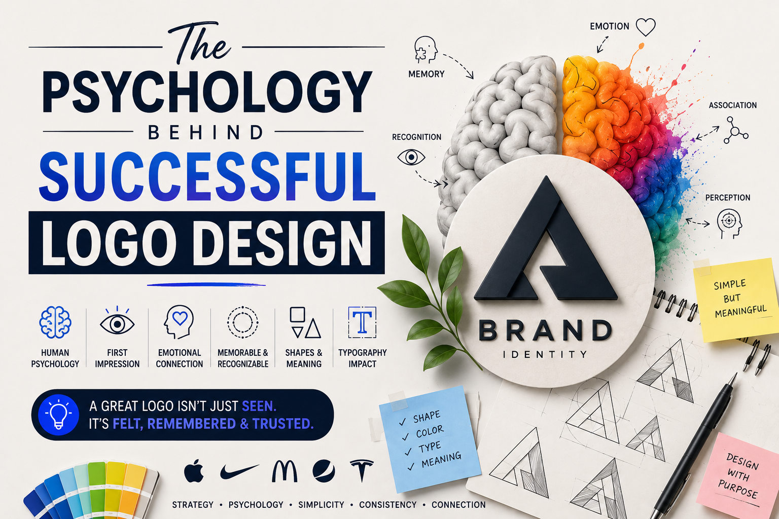
Why do some logos become instantly recognizable while others are forgotten within seconds?
Think about the logos you can identify without seeing the company name.
You probably don't need much time to recognize them.
That's not an accident.
Successful logo design isn't only about creating something visually attractive. It involves psychology, perception, memory, emotion, and visual communication.
A logo is often one of the first visual elements people encounter when they interact with a brand. Before customers read the company's story or understand its products, they may already be forming an impression based on its visual identity.
This is why effective logo design goes beyond choosing a nice icon and a good-looking font.
It is about understanding how people see, process, remember, and respond to visual information.
What Makes a Logo Psychologically Effective?
A successful logo usually does several things at once.
It should:
- Capture attention
- Communicate something about the brand
- Create an emotional response
- Be easy to recognize
- Be easy to remember
- Differentiate the business
- Work across different sizes and platforms
- Support the overall brand identity
The strongest logos don't necessarily explain everything about a company.
Instead, they create a visual association that becomes stronger every time someone interacts with the brand.
1. Simplicity Helps People Remember
One of the most important principles in logo design is simplicity.
A simple logo is easier for people to process quickly.
Think about seeing a logo on:
- A website
- A mobile screen
- A billboard
- Product packaging
- A social media post
- A business card
People may only see it for a fraction of a second.
If the design contains too many details, complicated shapes, or unnecessary elements, recognition can become harder.
That's why many successful brands use relatively simple visual systems.
Simple doesn't mean boring.
It means removing everything that doesn't contribute to the idea.
A good logo should be able to communicate its identity without requiring a long explanation.
2. Color Influences Brand Perception
Color is one of the strongest psychological tools available to a designer.
Different colors can create different associations depending on culture, context, industry, and personal experience.
For example:
Red can communicate energy, urgency, passion, or excitement.
Blue is often associated with trust, stability, professionalism, and reliability.
Green can suggest nature, health, growth, or sustainability.
Yellow can communicate optimism, energy, and friendliness.
Black can create associations with sophistication, luxury, authority, or minimalism.
But there is an important point:
There is no universal psychological meaning for every color.
Context matters.
A particular shade, combination, typography, industry, and visual style can completely change how a color is perceived.
That's why choosing a brand color shouldn't be based simply on:
“Blue means trust, so let's use blue.”
The better question is:
“What should this brand make people feel, and which visual system can communicate that feeling?”
3. Shapes Communicate Without Words
Shapes can also influence perception.
For example, rounded forms often feel softer, friendlier, and more approachable.
Sharp angles can feel energetic, technical, powerful, or dynamic.
Squares and rectangles can communicate stability and structure.
Circles can suggest unity, continuity, community, or completeness.
These associations aren't absolute, but designers can use them strategically.
Consider two imaginary brands.
A children's wellness company might benefit from softer shapes and rounded forms.
A cybersecurity company might use stronger geometric forms and sharper structures.
The logo doesn't need to literally show what the company does.
Its visual language can communicate the personality of the business.
4. Typography Has a Personality
Typography is often underestimated in logo design.
A typeface can completely change how a brand feels.
Compare:
A geometric sans-serif
with
An elegant serif
or
A handwritten script.
They communicate very different personalities.
Typography can make a brand feel:
- Modern
- Traditional
- Premium
- Friendly
- Technical
- Playful
- Serious
- Luxurious
- Minimal
This is why choosing a font because it “looks nice” isn't enough.
A good logo designer asks:
Does this typeface represent the personality of the brand?
5. People Recognize Patterns
Human beings naturally look for patterns.
This is one reason visual consistency is so important in branding.
When customers repeatedly see the same:
- Logo
- Colors
- Typography
- Shapes
- Photography style
- Graphic elements
they begin to associate those elements with the brand.
Over time, recognition becomes faster.
Eventually, customers may recognize the brand without consciously analyzing the logo.
That's one of the biggest goals of a strong visual identity:
Recognition without explanation.
6. Memorability Matters More Than Complexity
A logo doesn't need to tell the entire story of a company.
In fact, trying to communicate too much can make a logo harder to remember.
A memorable logo often has a clear visual idea.
It might use:
- A distinctive shape
- A clever symbol
- Unique typography
- A visual metaphor
- An unexpected combination
- A recognizable silhouette
The important part is that the idea is clear enough to remember.
A complicated logo may contain more information but create less memory.
7. Visual Metaphors Create Meaning
One of the most powerful techniques in logo design is the visual metaphor.
Instead of directly showing what a company does, the designer combines ideas into a meaningful visual.
For example:
A wellness brand might combine leaves with a human form.
A technology company might combine a digital symbol with an abstract representation of connection.
A logistics company might incorporate movement into its typography.
These concepts give people something to discover.
And when the visual idea is clever but still simple, it can make the logo more memorable.
8. Negative Space Can Create a Second Meaning
Negative space is another psychological tool designers can use.
Instead of filling every part of the logo, designers can intentionally use the empty space to create another shape or message.
This creates a small moment of discovery.
The viewer sees one thing initially.
Then they notice something else.
That discovery can increase engagement and make the logo more memorable.
But negative space shouldn't be used simply to show off design skills.
The hidden idea should contribute to the brand concept.
9. Emotional Connection Makes Logos Stronger
People don't always make decisions purely through logic.
Emotion plays an important role in how people experience brands.
A logo can contribute to that emotional relationship by creating a visual personality.
For example:
A luxury brand may want to communicate exclusivity.
A children's brand may want to feel playful.
A financial company may want to feel reliable.
A fitness brand may want to feel energetic.
A wellness brand may want to feel calm.
The logo is one part of a larger emotional system.
It doesn't create the entire emotional experience by itself, but it can establish the visual direction.
10. A Logo Must Work in the Real World
A logo can look fantastic on a designer's screen and still fail as a brand asset.
A successful logo needs to work across different environments.
For example:
Website → Social media → Packaging → Business cards → Signage → Merchandise → Mobile apps → Advertising
It should also work in different sizes.
A detailed logo may look beautiful on a large presentation but become unreadable as a tiny social media icon.
That's why scalability is part of successful logo design.
11. Context Changes How a Logo Is Perceived
A logo doesn't exist in isolation.
People see it alongside:
- Brand colors
- Photography
- Website design
- Packaging
- Advertising
- Typography
- Product experience
- Customer service
This means the psychology of a logo is connected to the entire brand experience.
A great logo cannot compensate for a terrible product.
Likewise, a relatively simple logo can become incredibly powerful when it is consistently connected to a strong brand experience.
12. Familiarity Strengthens Recognition
A logo often becomes more meaningful through repeated exposure.
The first time someone sees a new logo, it may mean nothing to them.
After seeing it repeatedly alongside positive experiences, they begin to associate the visual identity with the company.
Eventually:
Logo → Brand
The logo becomes a shortcut to everything the customer already knows about the business.
That's why changing a logo isn't always a simple design decision.
A brand may be changing something that customers have mentally associated with the company for years.
13. Differentiation Is a Psychological Advantage
A logo also needs to exist within a competitive environment.
Imagine ten businesses in the same industry using:
- Similar icons
- Similar colors
- Similar typography
- Similar layouts
Even if each logo looks professionally designed, the brands can become difficult to distinguish.
Good logo design asks:
What visual territory can this brand own?
The objective isn't to be different just for the sake of being different.
It's to create a visual identity that is relevant, distinctive, and recognizable.
14. AI Is Changing Logo Design—but Not the Psychology Behind It
AI has dramatically changed how quickly designers and businesses can explore logo concepts.
You can now generate hundreds of ideas within minutes.
That's incredibly useful for:
- Brainstorming
- Moodboards
- Concept exploration
- Visual experimentation
- Creative direction
- Early-stage ideation
But AI doesn't eliminate the psychological principles behind successful logo design.
A generated logo still needs to answer:
Is it memorable?
Is it distinctive?
Does it communicate the right personality?
Does it work at different sizes?
Does it differentiate the brand?
Will people recognize it later?
AI can generate possibilities.
Designers still need to decide which possibilities are worth pursuing.
15. A Successful Logo Is More Than a Pretty Symbol
One of the biggest misconceptions about logo design is that the best logo is simply the one that looks the most attractive.
That's not necessarily true.
A successful logo should solve a communication problem.
It should represent the brand appropriately and work within a larger visual system.
That's why professional logo design involves much more than drawing.
It involves:
Research → Strategy → Concept → Design → Testing → Refinement → Application
The final logo may look simple.
But the thinking behind that simplicity can be complex.
The Psychology of a Memorable Logo
If we simplify everything we've discussed, successful logo design often comes down to five major ideas:
1. Recognition
Can people identify it quickly?
2. Memorability
Can people remember it later?
3. Relevance
Does it fit the brand and its audience?
4. Differentiation
Does it stand apart from competitors?
5. Consistency
Does the brand use it consistently across touchpoints?
When these elements work together, a logo can become much more than a graphic.
It becomes a mental shortcut to the brand.
Final Thoughts
The psychology behind successful logo design isn't about manipulating people.
It's about understanding how people naturally process visual information.
Simple shapes can improve recognition.
Color can influence perception.
Typography can communicate personality.
Visual metaphors can create meaning.
Consistency can strengthen memory.
And distinctive concepts can help a brand stand out.
AI can now generate thousands of logo concepts in seconds.
But the real challenge isn't generating more options.
It's knowing which option communicates the right idea, creates the right perception, and can become a meaningful part of a brand.
That's where design thinking still matters.
A great logo isn't just something people see.
It's something they recognize, remember, and associate with a brand.
Comments 0
Join the Conversation